RESEARCH
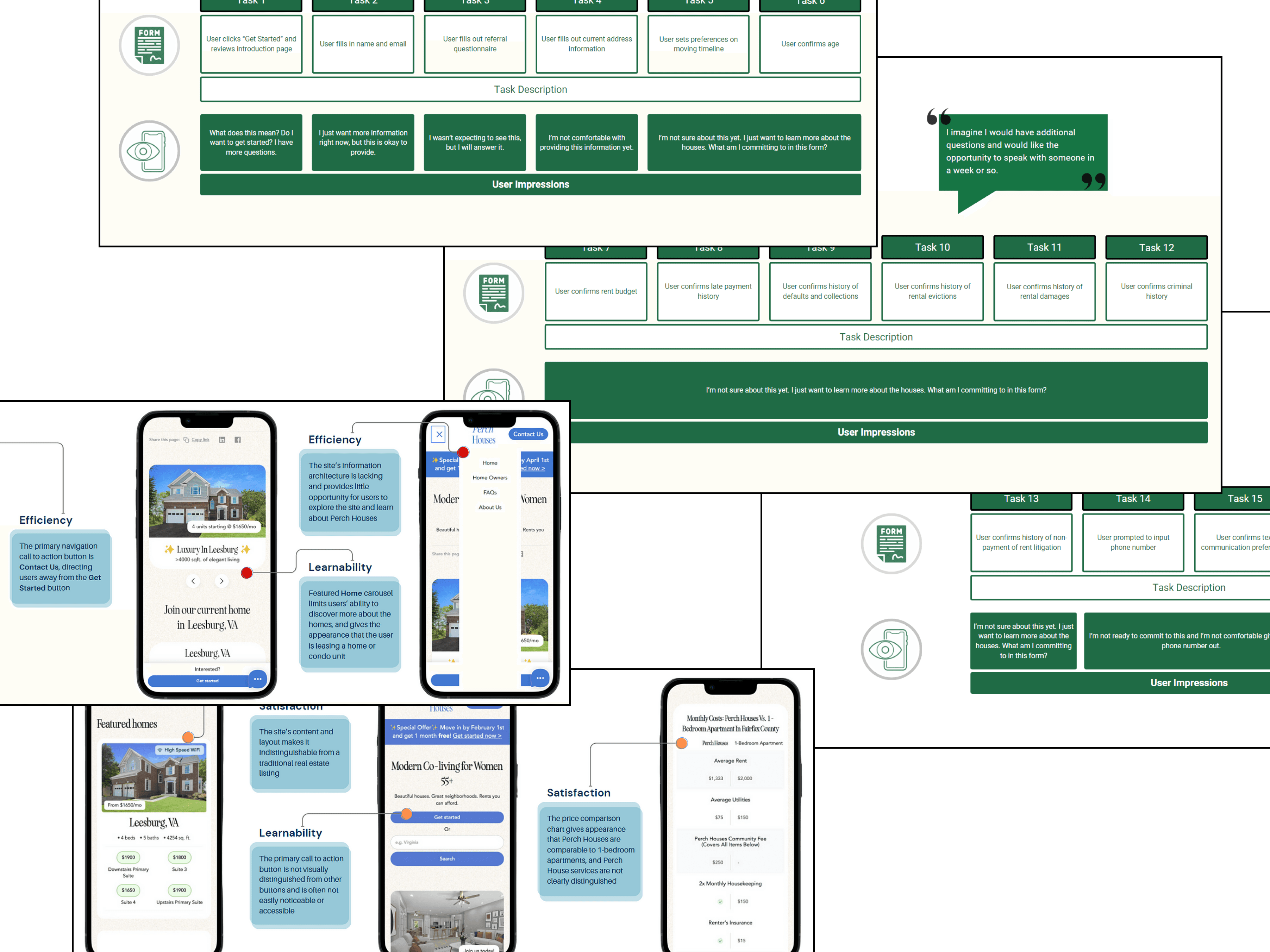
My team developed a comprehensive research plan with the goal of evaluating the usability of the existing mobile website (the most common use case for devices) through several methods. I conducted a heuristic evaluation of the existing site, and assisted in conducting usability tests to help the team validate — and just as importantly, invalidate — the assumptions from my heuristic evaluation. This set a baseline understanding for our entire team and the client of the users' behaviors on the site and attitudes towards the co-living concept.
I also conducted a competitive and comparative audit of other co-living sites, where I gained a great deal of insight about co-living onboarding challenges and opportunities, as well as a task analysis of the client's onboarding process that highlighted major friction points.
IDEATE
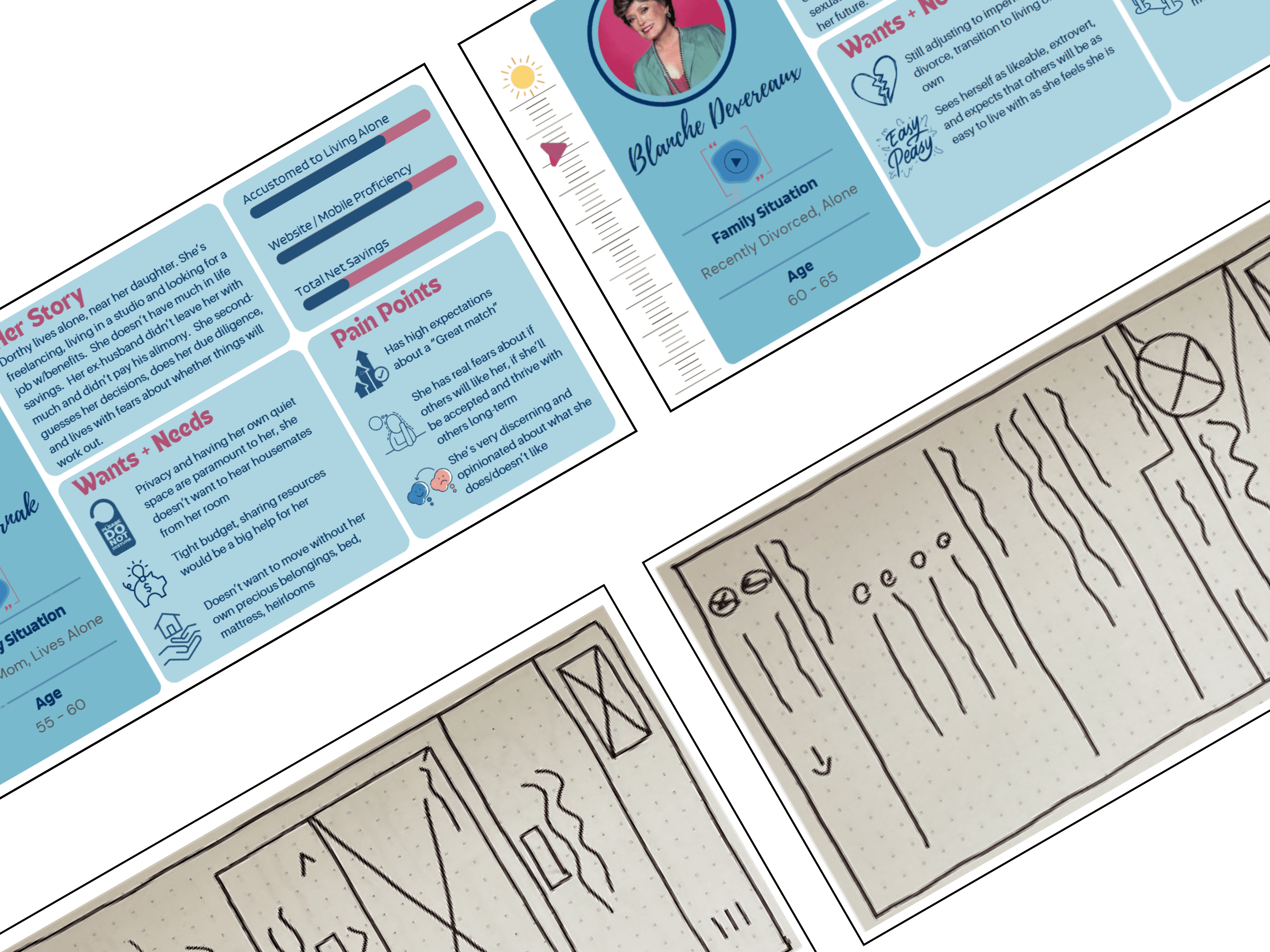
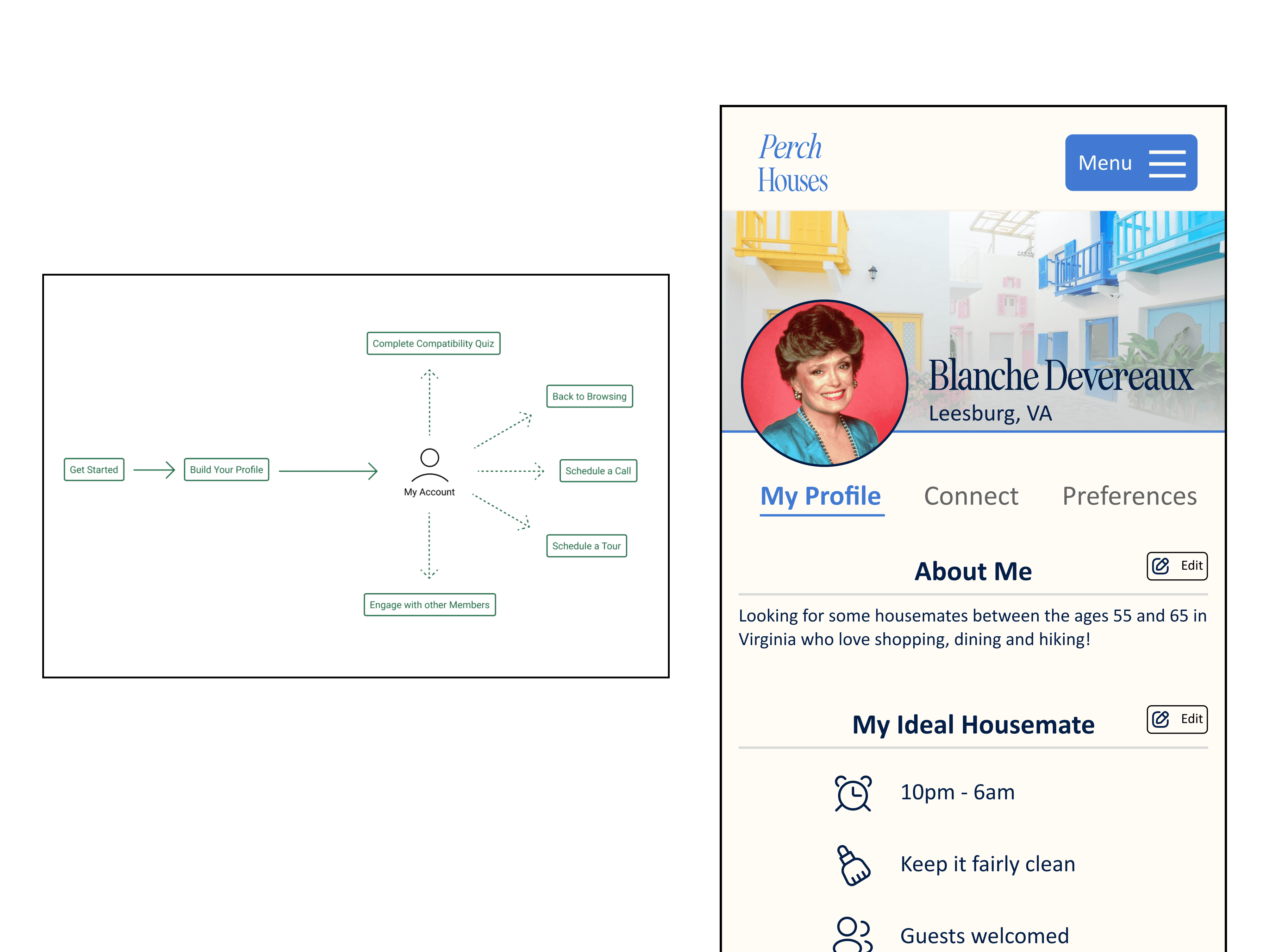
With multiple iterations of testing and rapid prototyping planned, we had to remain agile as we shared research and test insights to develop solutions for further testing. While the research team developed several user personas, I began breaking apart the cumbersome onboarding process by creating user flows and generating a content strategy plan with a new sitemap.
Sketching also became important towards the end of the project, as the need for an account portal became apparent. I sketched out several concepts and iterations for the account portal to visually communicate layout, structure, and key components to the team.
DESIGN
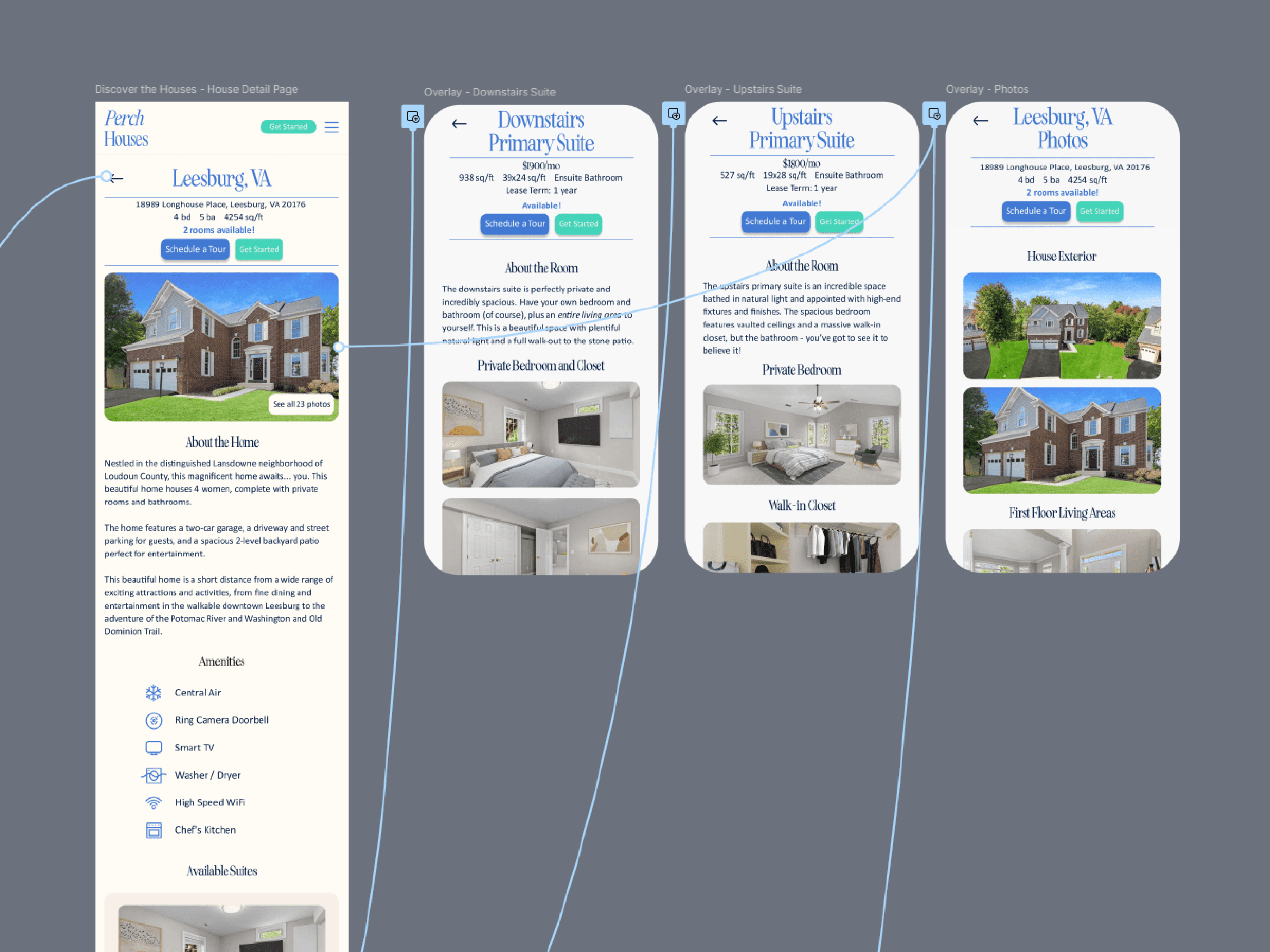
With insight from our first round of baseline testing, I got to work on strategizing new content, wireframing the layout of new pages, and developing a high-fidelity test prototype. Key pieces of design in the test prototype included the addition of modal overlays for house images and layouts, copy and content for new pages in the sitemap, a redesigned navigation menu, and re-strategizing the content structure and calls to action (CTA).
UX writing played a pivotal role in this project, as research revealed that Perch Houses' users were scrutinous readers, cautious decision makers, and hesitant to enter the conversion funnel by creating a profile and getting started.
ITERATE
My first prototype underwent usability testing with an additional 8 participants, and I developed separate versions of the prototype with different CTA prompts to A/B test user preferences for the inflection point in beginning the onboarding journey.
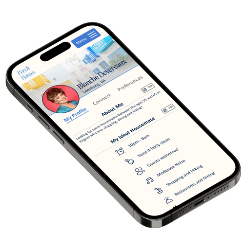
While test participants were very favorable to the redesigned site content and house detail pages, they remained hesitant to enter the conversion funnel. In particular, we noticed that the participants were largely skeptical of the compatibility matching the site offers and expressed doubt that anyone other than themselves could reliably judge compatibility with their housemates. This insight helped refine my vision for a simplified onboarding process with account creation, and I designed an account experience that allows users to connect with compatibility matches and decide for themselves whether they are a match to co-live together.
KEY INSIGHTS AND DESIGN SOLUTIONS
SHOW ME FIRST
DISCOVERY
Users’ first step in exploring Perch Houses’ offerings was to see everything about the available homes, from photos, to layouts, to pictures of the surrounding areas. Picture carousels got in the users’ way, with some not realizing the carousel was there and others suffering from click fatigue trying to go through the carousel.
DESIGN SOLUTION
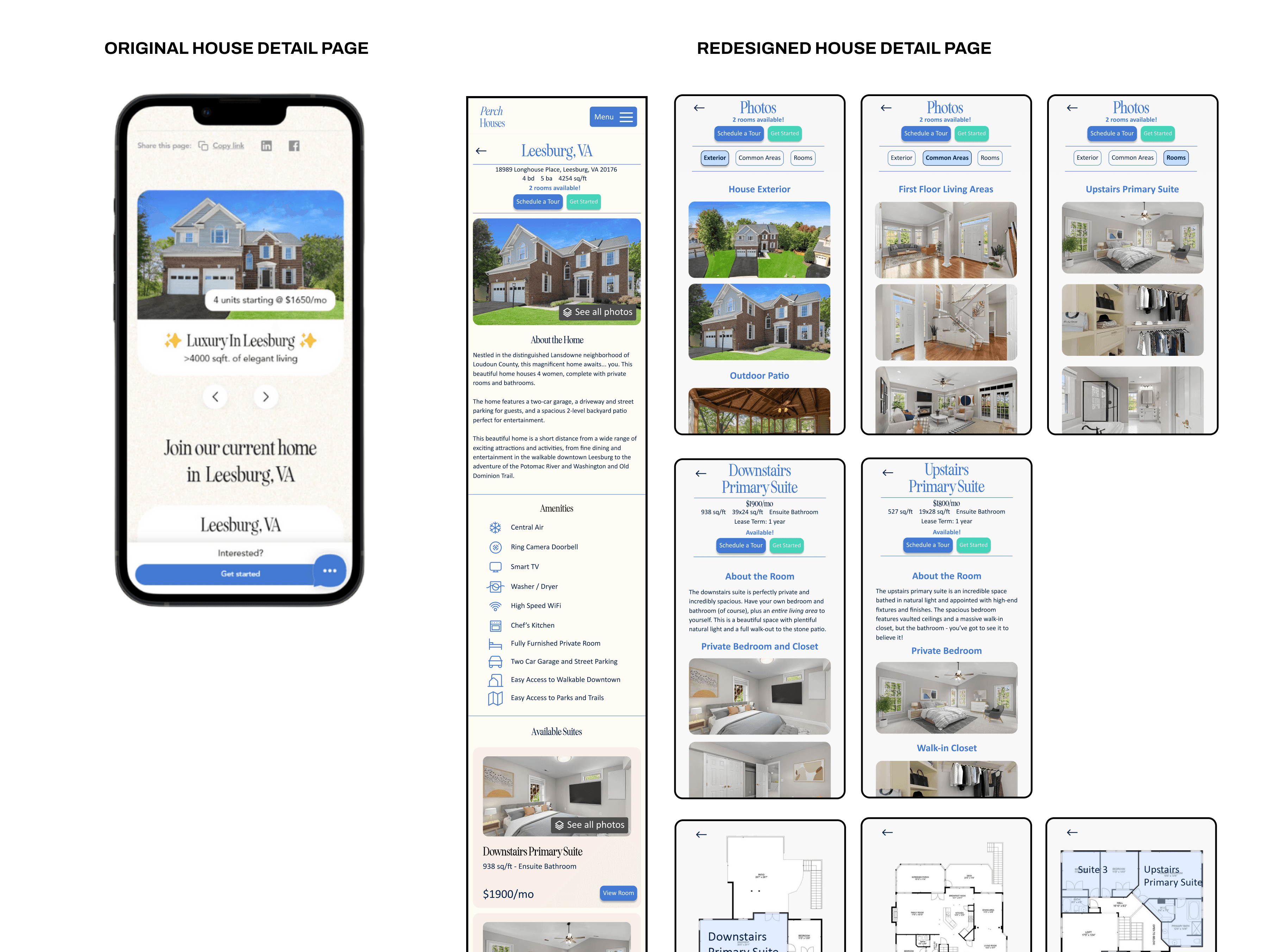
House detail pages were overhauled to give users quick and easy access to photos through modal overlays, house layouts were added, and additional content and functionalities were added to highlight the surrounding restaurants, shopping, nature trails and other notable attractions.
WHERE DO I GO FROM HERE?
DISCOVERY
Users spent most of their time on the homepage due to limited information architecture and navigation features. This issue was further complicated by the discovery that a great deal of Perch Houses’ users do not engage with navigation bars and prefer to explore through the content of the site directly.
DESIGN SOLUTION
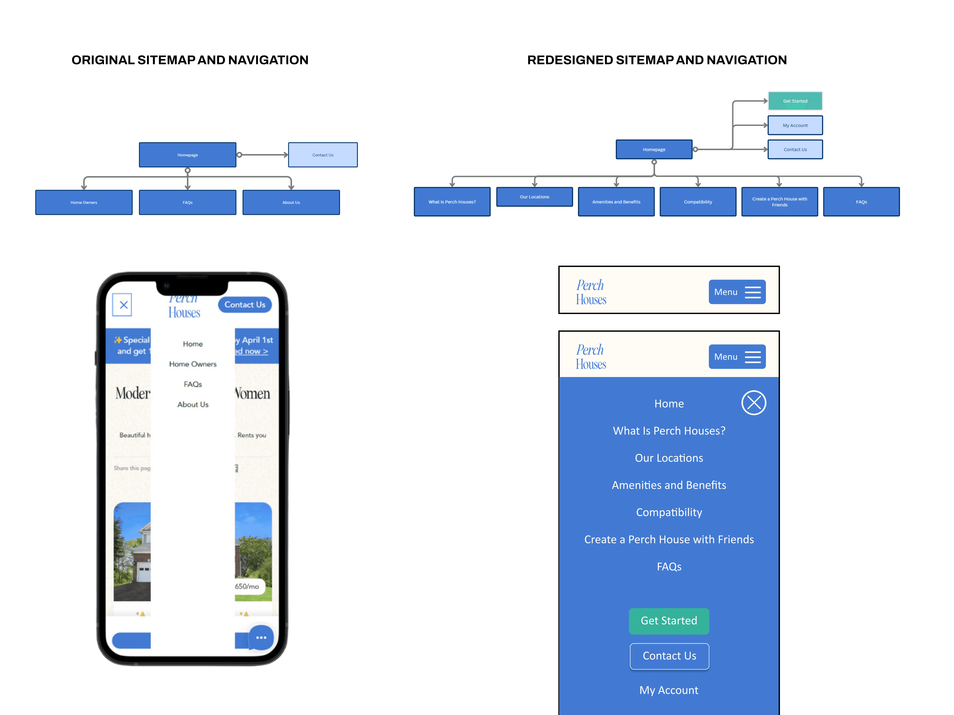
The sitemap was substantially restructured to include additional content relevant to users’ due diligence, the navigation bar was redesigned to take center stage when activated, and all navigation destinations were naturally worked into the site’s content to provide organic exploration of the site’s offerings without having to touch the nav bar.
LET ME TAKE MY TIME
DISCOVERY
Users were hesitant to enter the Get Started conversion flow, as they believed it to be too big of a step to take and they weren’t ready. This effect was worsened by an onboarding flow that took users directly from building a profile to answering background questions and completing a compatibility quiz, making the bar of entry too high.
DESIGN SOLUTION
An overhaul of the site’s content resulted in an experience that gives a clear explanation of the obligation-free nature of the Get Started process. Perhaps even more importantly, the onboarding user flow was broken up from “next step” processes to get users signed up with as little commitment as possible and landing them at a My Account portal.
COMPATIBILITY IS MY CALL
DISCOVERY
Users were skeptical of Perch Houses’ compatibility quiz and housemate matching system, believing that no digital product could make this decision without their input. Users were also concerned about compatibility issues between other housemates presenting uncomfortable living outside of their control.
DESIGN SOLUTION
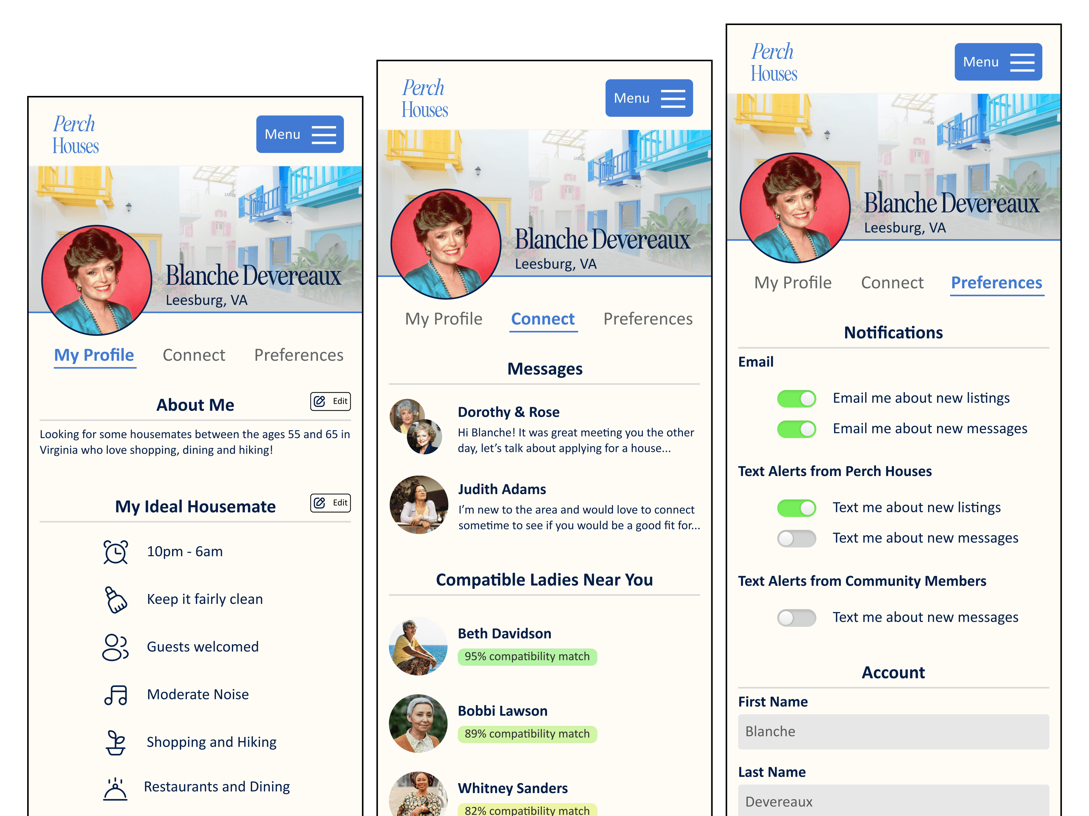
Additional content and systems were designed to let users determine compatibility with other potential housemates on their own terms. Users were given the power to investigate compatibility by messaging with other members, seeing high compatibility matches with other members, and applying as housemates together.
EMPOWERING USERS IN THE CO-LIVING EXPERIENCE
HOME EXPLORATION TAILORED FOR THE USERS
My team's user testing revealed that house detail pages were the first step forward for users in evaluating Perch Houses' co-living concept. My initial assumption from a heuristic evaluation was that 55+ women were hesitant to get started with a co-living application because they did not fully understand the co-living concept. While there was a learning experience for some users, this assumption was largely invalidated by testing. Users understood the concept of co-living fairly well — they just weren't sold on the living arrangements.
In particular, we noted that ideal users were quite demanding about every detail of the house. What is the house layout, and how close are rooms to common areas? What is the parking situation, and who gets to use the garage and driveway? What is the neighborhood like, and what nearby shopping and dining amenities are in the area? What rooms get morning and afternoon light? These are some of the questions important to users that weren't being answered in the existing website.
In redesigning the house detail pages, I paid careful attention to these details to give a clearer picture of what living in the house would be like. I also broke up picture carousels — which housed all home images and led to click fatigue — into modal overlays separated by area for easier access to the home images users were looking for. Below is a before and after comparison of the house detail pages to demonstrate the level of detail incorporated in the house detail pages.
INFORMATION ARCHITECTURE BUILT FOR INQUISITIVE MINDS
I quickly realized that building out the site's information architecture was a critical part of the project. In the first round of usability testing, users spent most of their time browsing the homepage, either looking to learn more about the individual houses or unsure of where to go next. We also noticed during testing that some users avoided the navigation bar altogether, either not realizing it was there or opting to explore through the homepage itself.
I went through many iterations of the navigation menu before landing on a design that was more intuitive for users and incorporated the expanded information architecture. I also included relevant buttons in the content of each page for users that avoid the navigation menu, allowing them to interact only with the site content and still organically explore the site. Below is a before and after of the sitemap and navigation features.
STRATEGIZING CONTENT DELIVERY
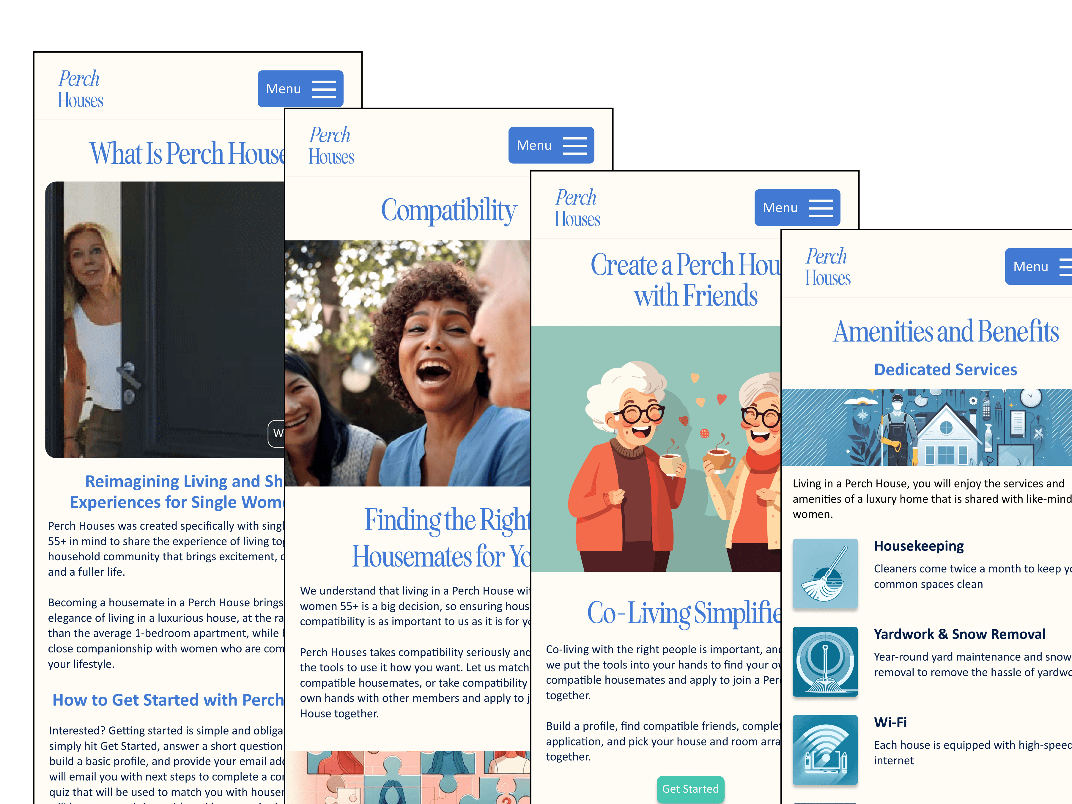
Content strategy and UX writing played an important role in my redesign of the site. We learned over several rounds of usability testing that Perch Houses' ideal users engage with written content much more thoroughly than the average internet user. They read and consider every word, and look for more information to convince them to engage with a call to action.
In strategizing how to deliver Perch Houses' message to a diligent and scrupulous audience, I created several pages of content to categorize the co-living experience into the subjects that mattered to the users. I created new pages of content for users who wanted to dive deeper on home amenities, compatibility matching, and how the Perch Houses co-living experience works so they can sign up without hesitation.
For UX writing, I used an upbeat but direct tone, highlighting the positives of the co-living experience but limiting salesmanship to ensure that the audience felt respected. After all, they are reading much more than the average user, and that time needs to be respected. I focused on writing longer-than-usual pieces for body content, and included links to other pages directly in the copy for users who wanted to explore without touching the navigation menu.
PUTTING COMPATIBILITY INTO THE HANDS OF THE USERS
After our first of usability testing and prototyping, we were confident that test participants would be more receptive to entering the co-living application funnel. However, while users performed much better in navigating the site and validated many of the design decisions I made to improve the co-living discovery experience, they remained hesitant to get started and go through the onboarding flow.
After analyzing user data and qualitative insights, we determined that there were two primary roadblocks for users — (1) the onboarding process was extremely intrusive and time-consuming, with the user filling out a rental suitability questionnaire and then moving straight into an extensive compatibility quiz before they felt ready, and (2) users were still skeptical that the compatibility matching system could place them with housemates with true compatibility.
While I was aware of the first insight after conducting a task analysis, I was caught off-guard by the second. But it made sense once I thought about it. Leaving your home and moving into a new house with new people is a big, big decision, and users don't want to be stuck with the consequences of moving into a house with people they struggle to get along with. Users expressed doubt that an online compatibility quiz could navigate these intricate human connections, and I saw this perspective clearly.
Therefore, putting compatibility into the hands of the users became a priority in my design, and in breaking up the onboarding flow, I created an account portal where women could complete onboarding steps at their pace, find other women that matched them in the compatibility quiz, and give them tools to connect with each other and determine for themselves whether they are compatible.

