MISSION

ELEVATE THE FIRST TIME USER EXPERIENCE FOR PLAYERS IN ELDEN RING

PROJECT

ELDEN RING

ROLE

UX/UI DESIGN

BRIEFING

Elden Ring, a critically acclaimed action role-playing game developed by FromSoftware, is known for its vast open world, deep lore, and challenging combat mechanics. This is not an easy game to beat, and players are in for a long journey and gameplay with a great deal of depth, but the game was a critical success and collected a trophy case of Game of the Year awards from various award panels and publications.

Despite its success, Elden Ring still has plenty of areas to improve the player experience, particularly when it comes to the game’s user interface (UI) and first time user experience (FTUE). The game’s steep learning curve and minimal handholding can create significant barriers for new players, especially those unfamiliar with the mechanics typical of the “Soulsborne” genre.

I'm an avid gamer in my free time, and while Elden Ring is one that I had a great time with, I recognized that there were plenty of opportunities for improvement of the onboarding experience for new players. I took this on as a passion project, and aimed to enhance the first-time user experience for Elden Ring players by improving onboarding, tutorials, and early-game guidance while preserving the game’s core challenge and sense of discovery.

DESIGN METHODOLOGY

DESIGN METHODOLOGY

RESEARCH

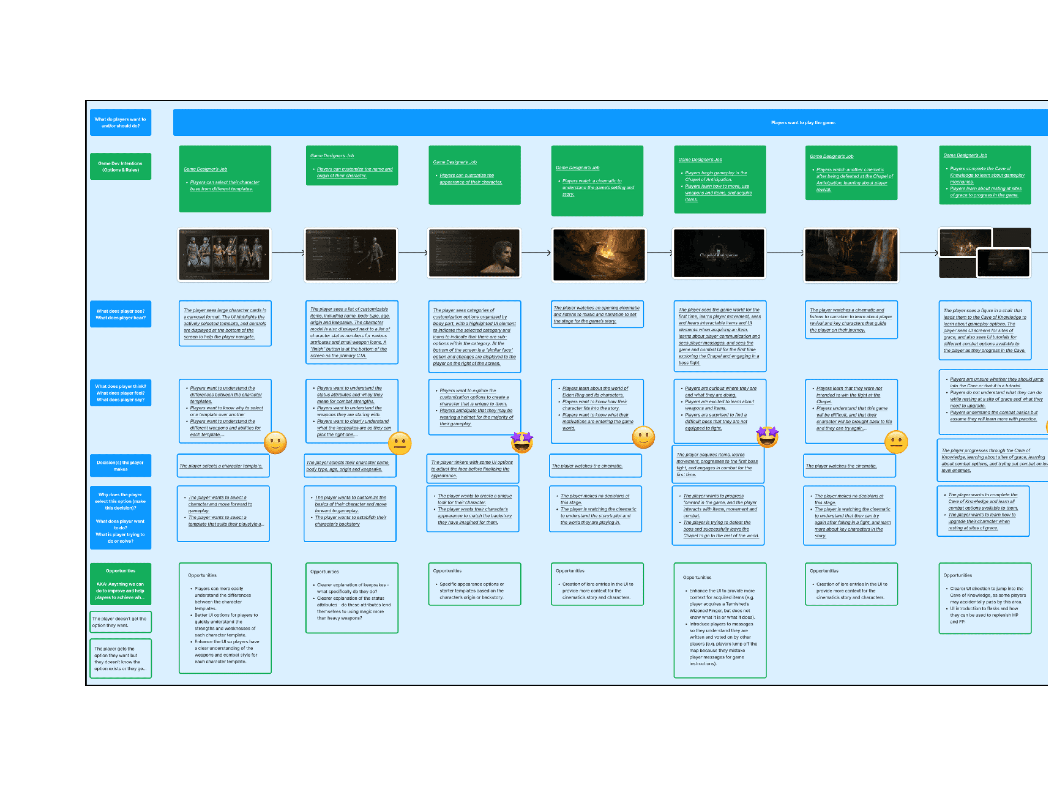
I started this project by evaluating a heuristic evaluation the current onboarding experience for new players and reviewing gameplay of 3 players. I have my own opinions of my first experience with the game, but I reviewed the gameplay journey of other players to see how their experience was the same or different from mine.

After reviewing gameplay footage, I created a journey map documenting the experience for these players. What did they see? What did they do? Where did they get stuck or confused? Where were the greatest opportunities for improvement?

IDEATE

After researching player journeys in their first experience with the game and identifying opportunities for improvement, I set out to create an enhanced onboarding experience that helps players understand the "why" behind their decisions and deliver effective communication of gameplay fundamentals.

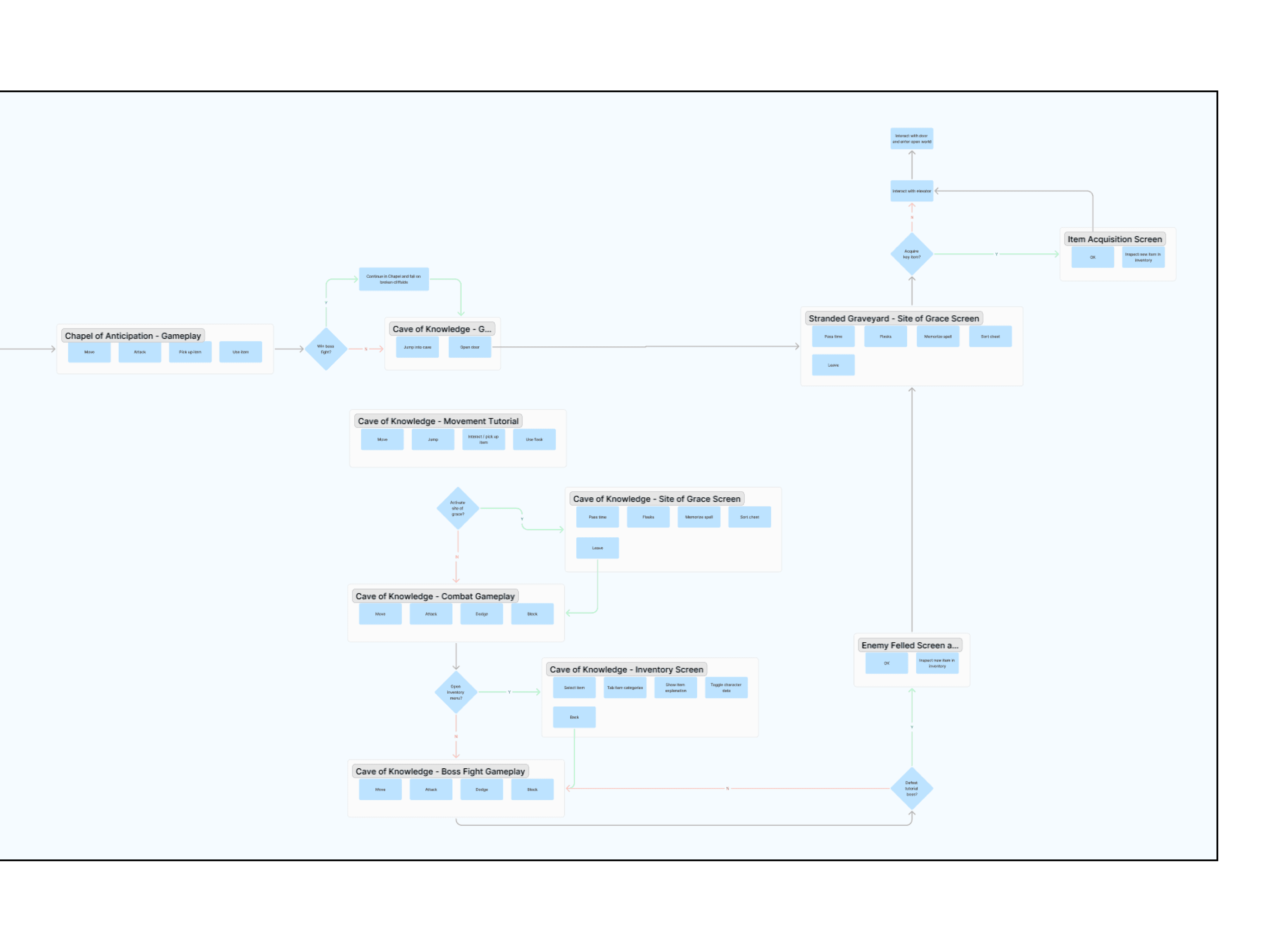
I began with creating updated user flows for the FTUE, focusing on communicating player base templates more efficiently to players, identifying key player attributes and items. I also spent some time redesigning the interactivity of the item acquisition UI, as the current item acquisition screen interrupted the players' experience at often inopportune times. I then constructed a paper prototype to review with players to determine if the available options in each screen were intuitive.

DESIGN

With redesigned user flows, I began constructing wireframes for each of the onboarding screens. I focused on taking advantage of the screen's real estate to deliver more useful information to the player about each character base to help them understand the strengths and weaknesses of each character, as well as a description of the items.

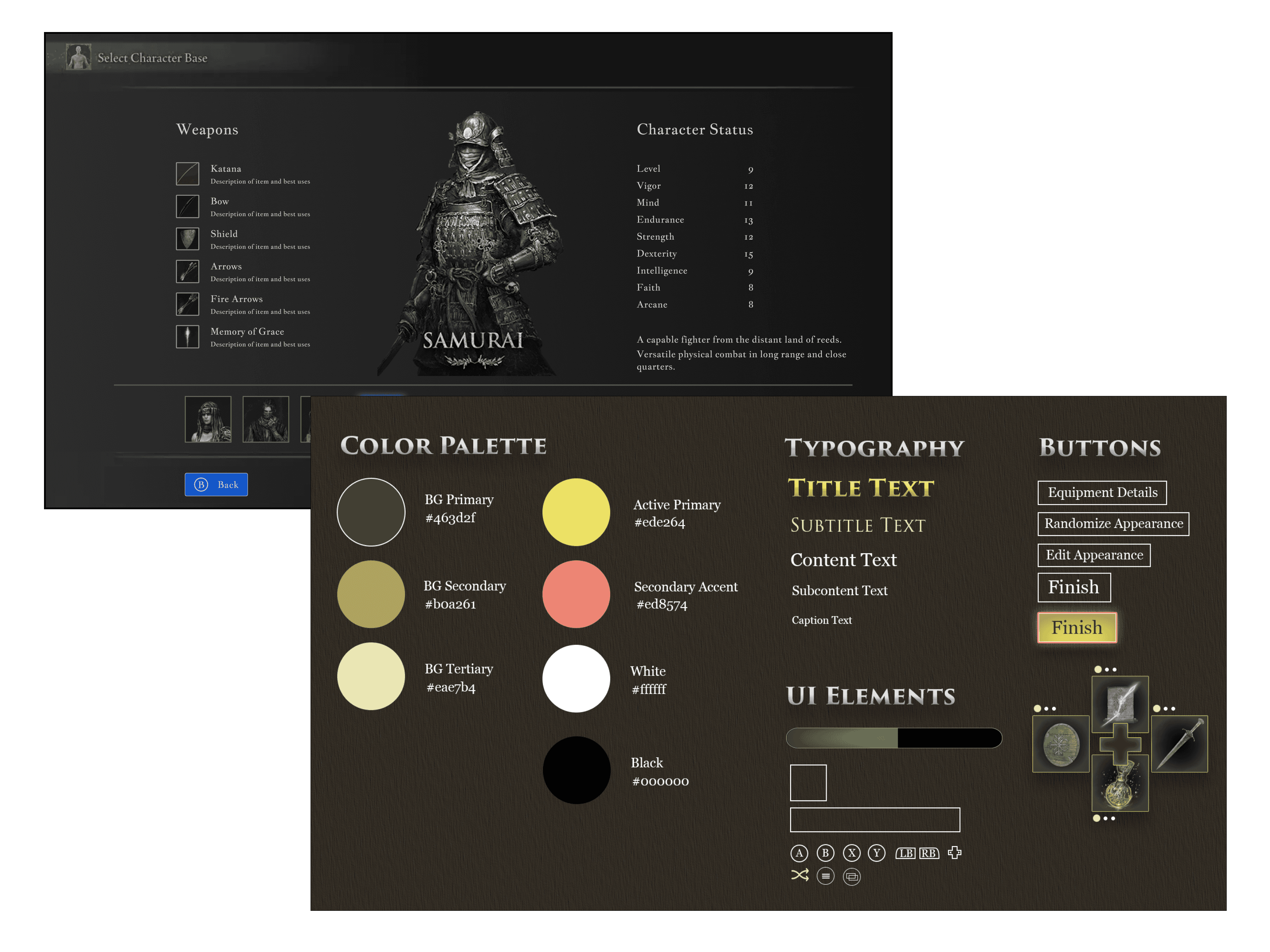
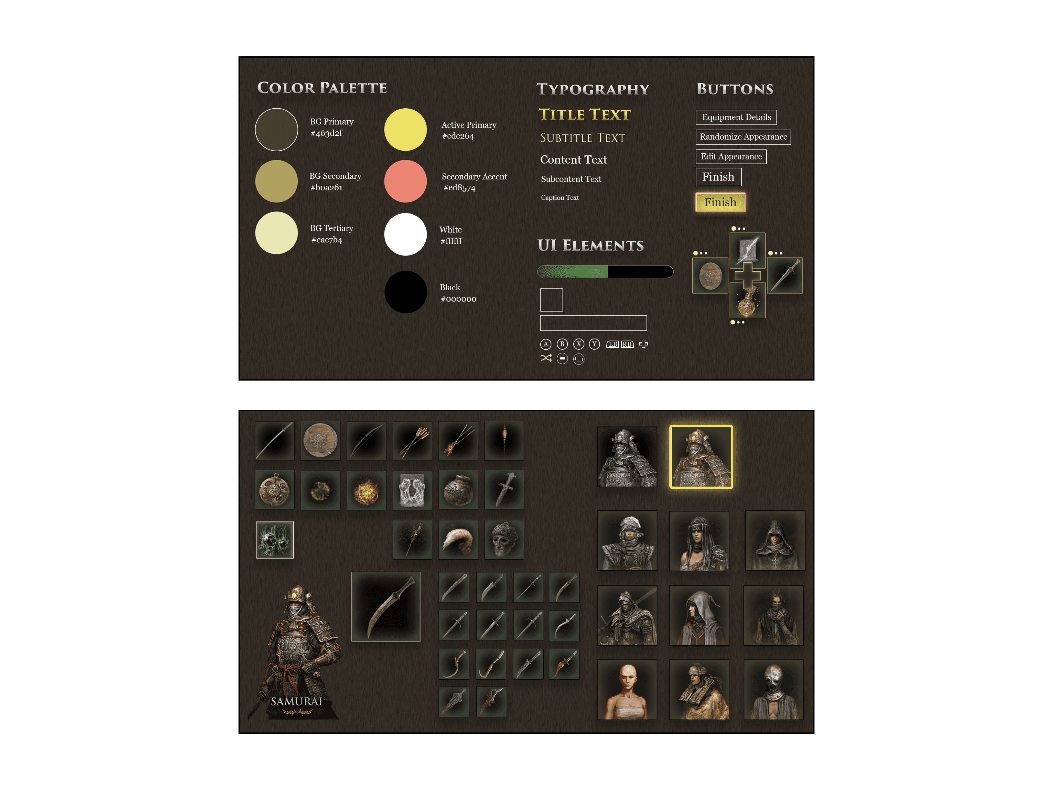
I also created a UI style guide to define styles, colors, and typography that remained true to the atmosphere and tone of the game. I developed a color palette with several shades of brown to create definition, a primary gold for active states of interactive information, and a rose gold accent for additional contrast. These wireframes were put together into a test prototype for usability testing with players.

ITERATE

I conducted usability testing with 5 players to determine whether players had a better understanding of the onboarding experience and identify areas of further refinement. Testing yielded additional insights about preferred layouts and further visual distinction between interactive buttons and non-interactive information on the screen.

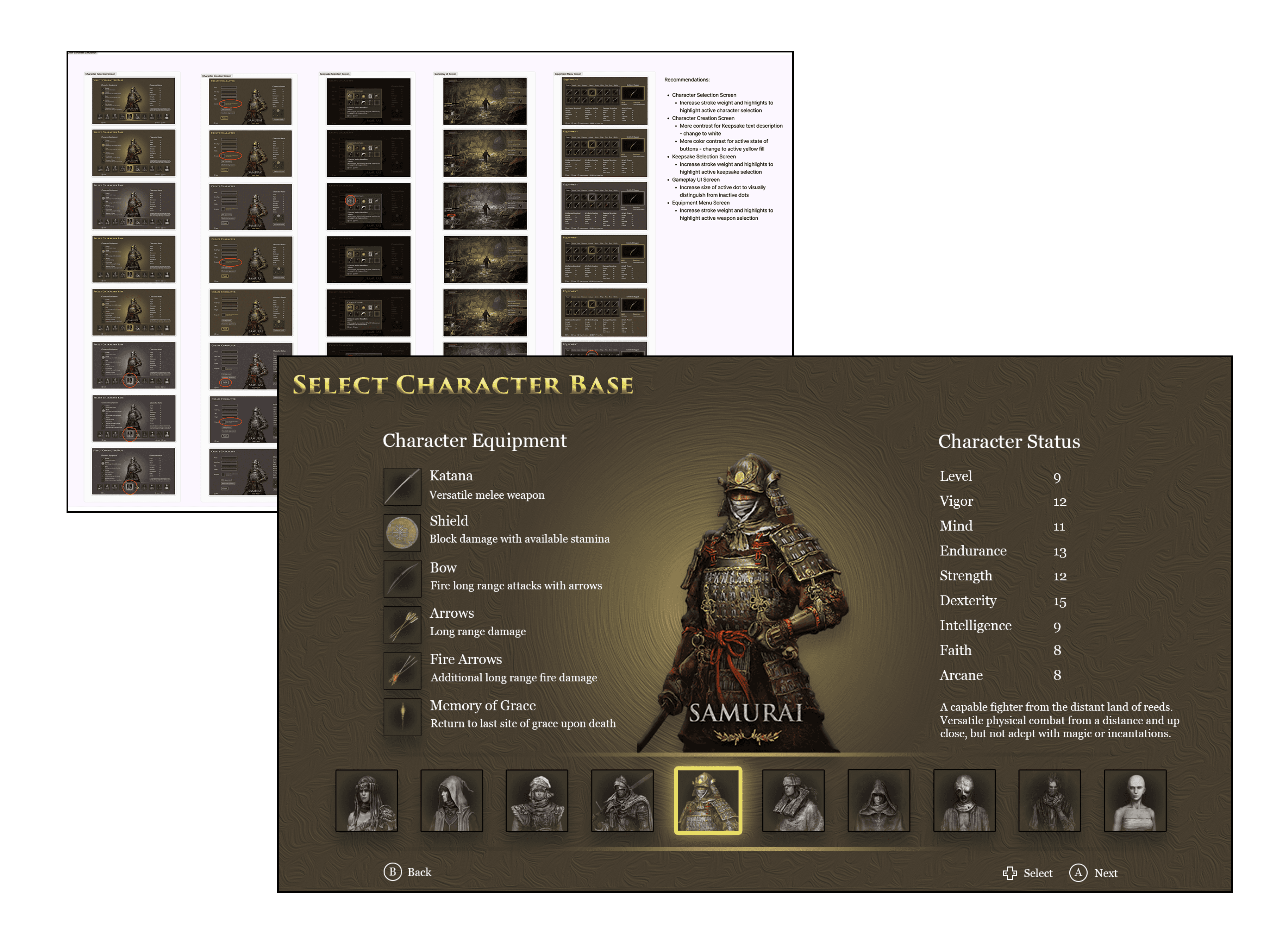
In addition to usability testing, I conducted a full accessibility audit of hi-fi mockups of the final screens to identify where my designs lacked color contrast for colorblind players. After reviewing the results, I made several tweaks to the contrast of certain UI elements to ensure an accessible onboarding experience.

KEY INSIGHTS AND DESIGN SOLUTIONS

KEY INSIGHTS AND DESIGN SOLUTIONS

WHO IS THE CHARACTER FOR ME?

DISCOVERY

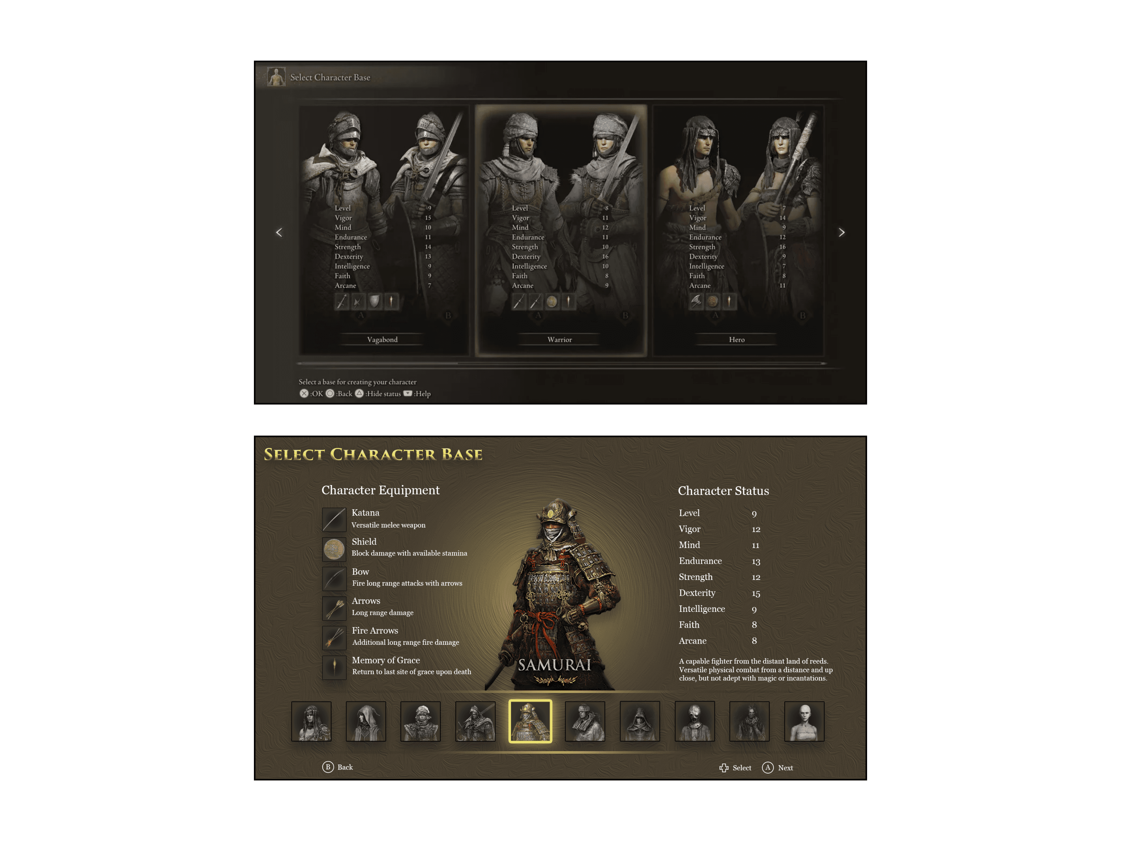
When starting a new game, players are tasked with selecting a character base to begin with, but little communication about the differences between them. Players often failed to understand the differences between the character bases and play styles and were confused whether they were making the right selection.

DESIGN SOLUTION

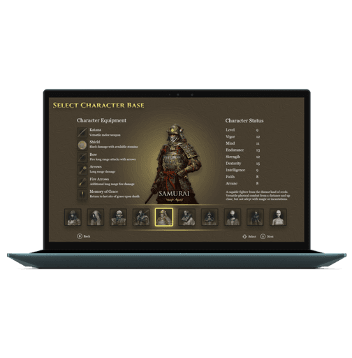
The character base selection screen was redesigned to maximize the screen's real estate and provide more details about each character. Blending UX writing with Gestalt principles, I created a new screen that allows players to quickly process the information on the screen and understand why they would select one base over another.

COMMUNICATING CHARACTER CREATION

DISCOVERY

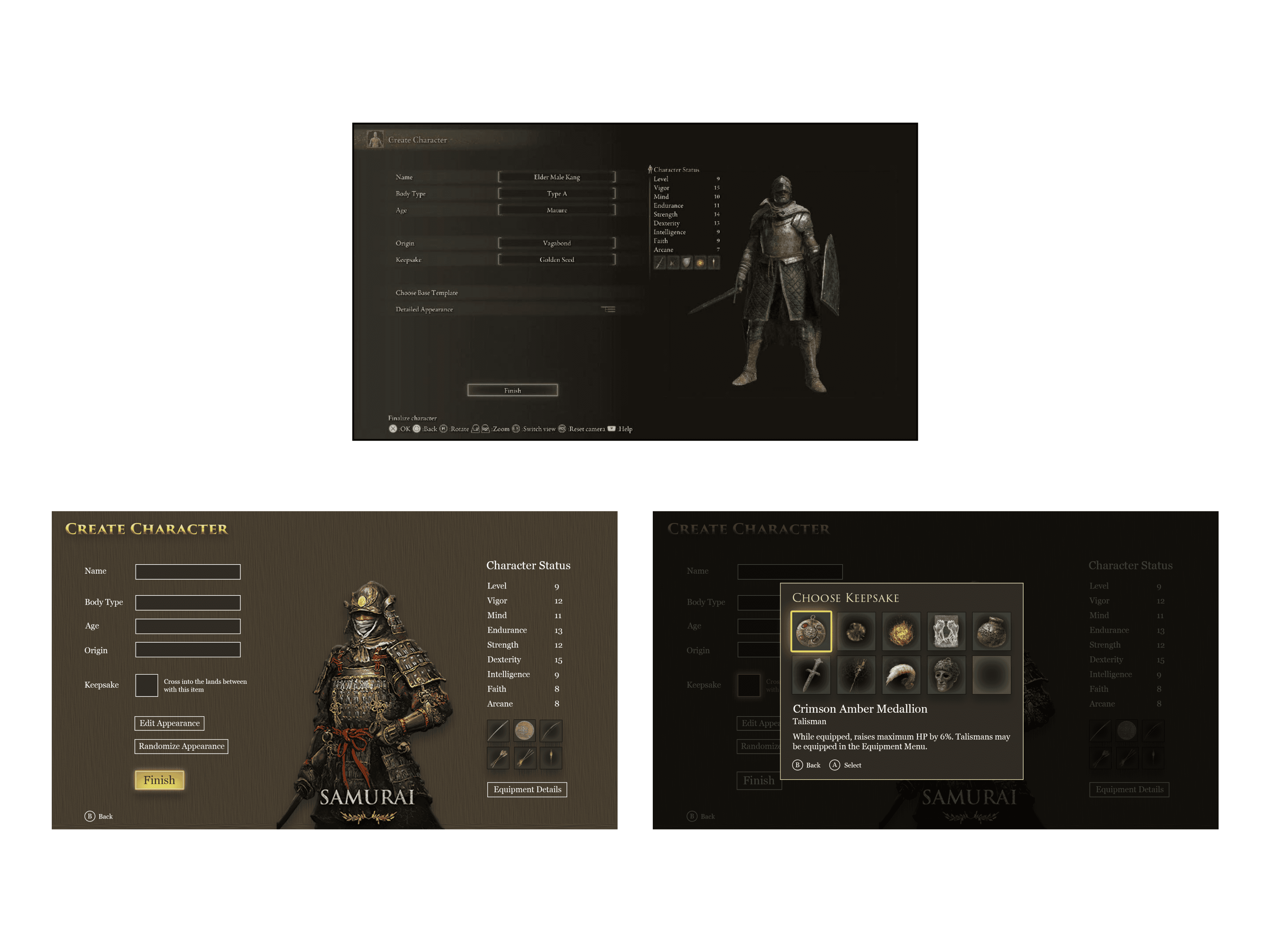
Players were similarly confused when customizing their character, unsure of what categories of information where personal to the player or relevant to gameplay. Across the board, players were largely confused about keepsakes, and failed to understand what they were and how they would affect their gameplay.

DESIGN SOLUTION

The character creation screen was redesigned to group certain items to create a more intuitive link between them, and an additional description was added to explain the nature of keepsakes. I also designed a modal overlay to provide a more visual experience where players could see the keepsake item and read about what it does.

ITEM ACQUISITION MADE EASY

DISCOVERY

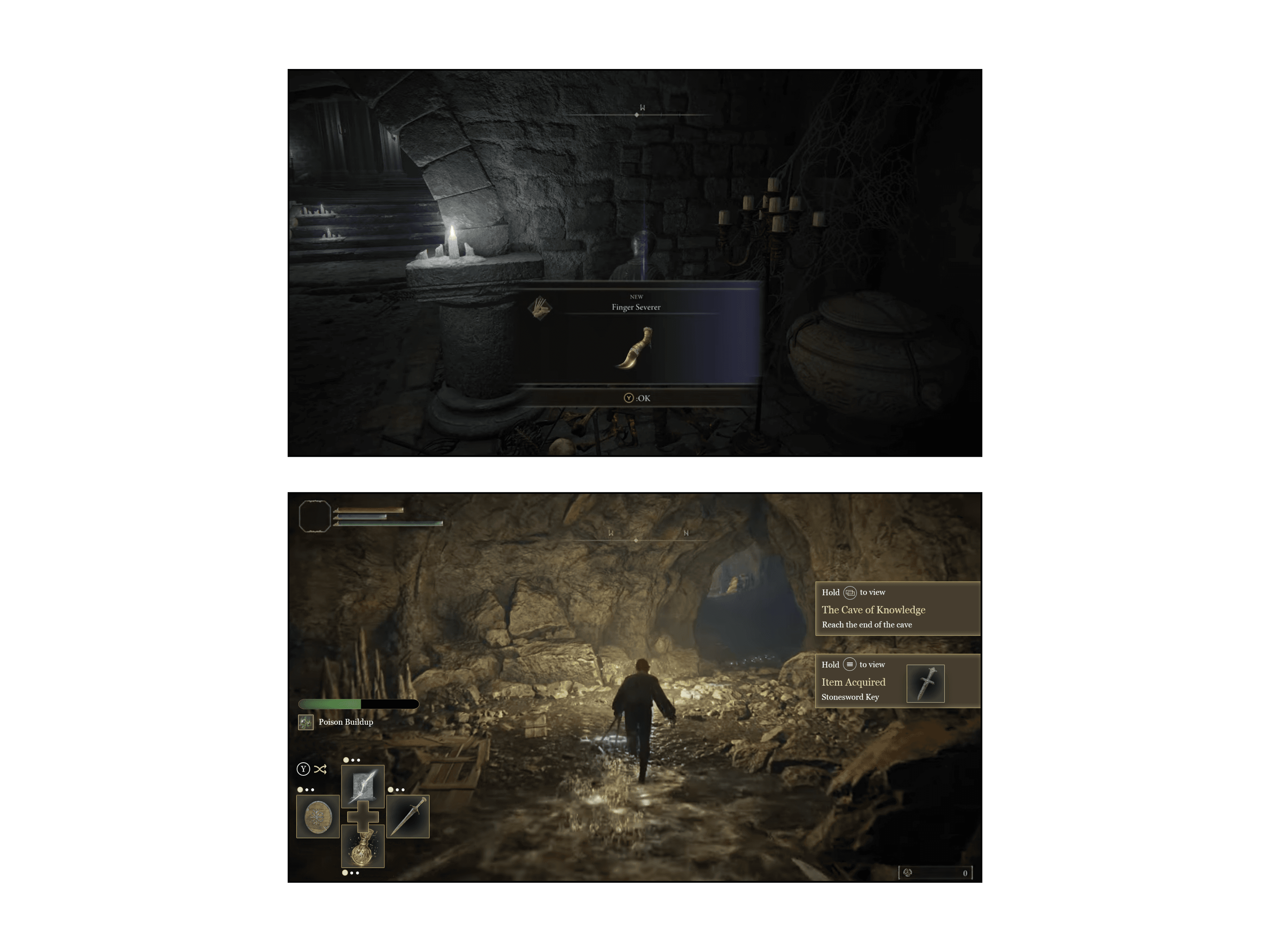
In the "Cave of Knowledge" tutorial area, players often struggled with the item acquisition modal overlay, as it appears on the middle of the screen and does not leave until dismissed, partially hijacking the player's controls and causing interference during a combat scenario. After dismissing the overlay, players were often confused about how they could find and inspect the item.

DESIGN SOLUTION

I redesigned the item acquisition modal overlay as a side panel that slides in to alert the player about the item without obstructing their view. I also adjusted the interactivity of the overlay, so the player can press and hold the select button to view the item in their inventory.

ORGANIZING A WEALTH OF WEAPONS

DISCOVERY

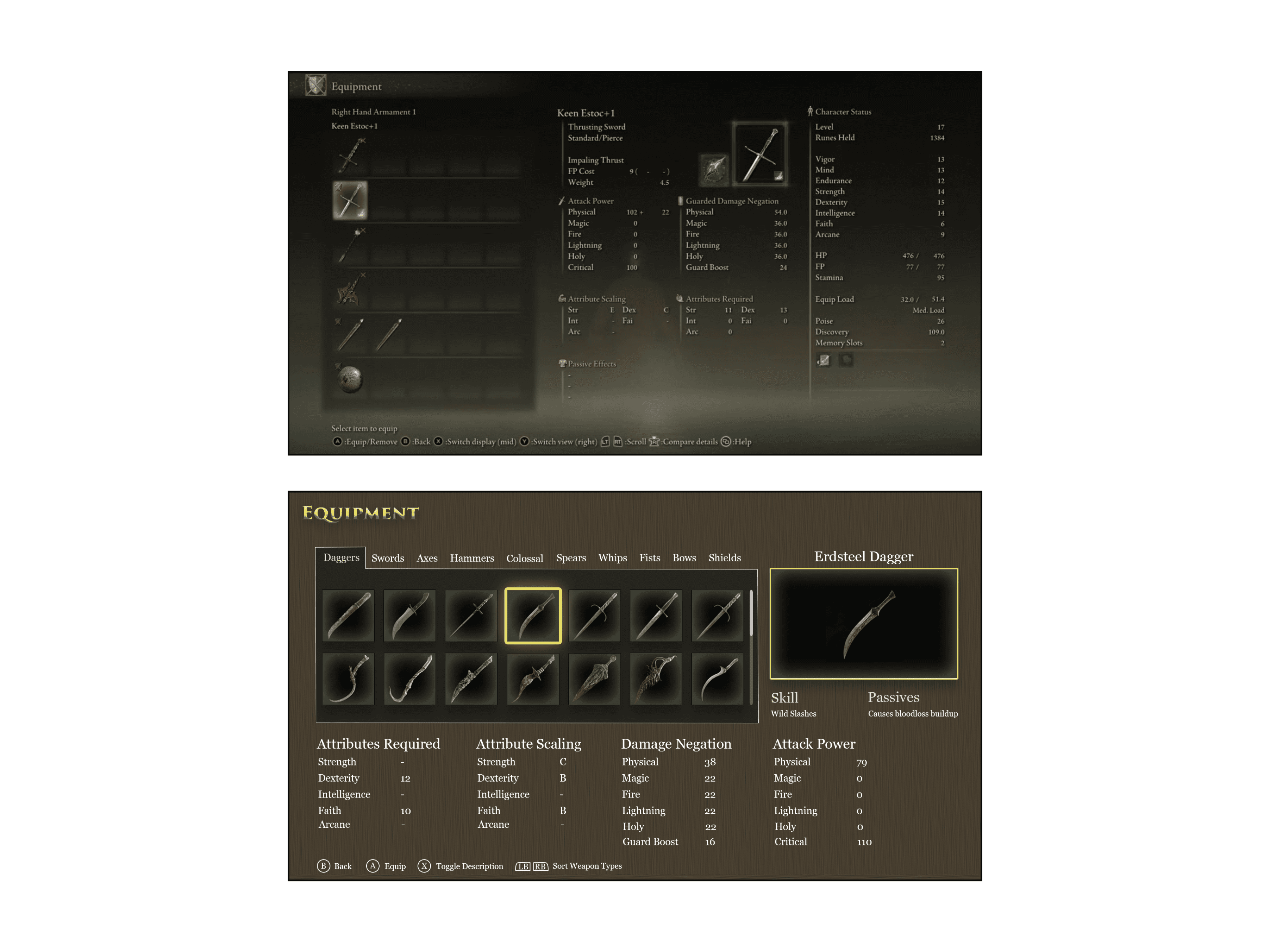
As players began to acquire more items and weapons in the game, they became increasingly confused about how to organize all of these items. In particular, there is a large variety of weapons in the game, but the information architecture of the equipment screen made it difficult for players to understand where to locate weapons.

DESIGN SOLUTION

I redesigned the information architecture of the equipment, using a tab system to allow players to easily tab between weapon types to find the exact weapon they are looking for without scrolling through a needlessly long list. More screen space was devoted to weapon statistics, allowing players to easily identify each weapon's relevant attributes.

A FIRST TIME USER EXPERIENCE OPTIMIZED FOR THE PLAYERS

A FIRST TIME USER EXPERIENCE OPTIMIZED FOR THE PLAYERS

ESTABLISHING A STYLE GUIDE

My first step in taking wireframes to hi-fi mockups is to define the styles, colors, and typography that will not only serve the usability of the UI screens, but remain true to the style, theming and atmosphere of the game itself. Remaining true to the current Elden Ring experience, I developed a color palette with several shades of brown to create definition, a primary gold for active states of interactive information, and a rose gold accent to create additional contrast.

Typography was split into two fonts — a highly stylized all caps font for UI titles and subtitles consistent with the “holy” and “regal” atmosphere of the game’s art direction, and a clean but fitting serif typeface for text content.

In addition to the UI style guide, existing art assets were adjusted in Photoshop to add texture to the UI screens and maintain the medieval style of the game through the use of drop shadows, inner glows, and stroke effects.

SELECTING A CHARACTER BASE WITH CONFIDENCE

From my research, it was apparent that players needed to better understand the character selection decisions they were making, as the current onboarding experience leaves far to many unanswered questions. Which build suits my playstyle? What are the strengths of this character base? What are its drawbacks? What are these items they have and how would I use them?

I focused on delivering this information in a format that would allow players to absorb it quickly and move to the next character base. In doing so, I dedicated the entire screen to information about each character, while maintaining a selection list at the bottom of the screen so the player understands which character base they are inspecting and how many others there are.

Below is a before-and-after of the current character base selection screen and my redesigned character base selection screen.

KEEPSAKE CONFUSION SOLVED

After selecting a character base, players were often confused by some of the character creation options. Most notably, players had no idea what a keepsake was, and the current UI does very little to explain this to the player.

In my redesign, I reorganized the relationship of some of the options, using spacing to create common regions for related fields. I made the most significant changes to the keepsake selection option, making the selection an image to give additional visual context for the item, adding additional text to explain the nature of keepsakes in the tone of the game, and adding a modal overlay for players to expect each keepsake and its properties.

Below is a before-and-after of the current character creation screen and my redesigned character creation screen with the keepsake selection modal overlay.

ITEM ACQUISITION WITH THE RIGHT AMOUNT OF ATTENTION

One of the more frustrating experiences for users as they begin to play the game is dealing with the item acquisition overlay. After acquiring an item, the overlay displays on the middle of the screen, and it will stay there until the user presses a button to dismiss it. This becomes a headache for players when they are in combat, covering a portion of the screen and disabling some of their combat options until the overlay is dismissed.

Additionally, players often acquired an item of interest, but were unsure where to find it after dismissing the overlay. There is no option in the overlay to take the player directly to where the item is in their inventory, often resulting in an inventory scavenger hunt to locate and inspect the item they just picked up.

In my redesign, I wanted to alert the player about the item they acquired without taking away the player's control of the situation, while giving an option to inspect the item directly in the inventory. The inventory overlay slides out from the right side of the screen where it doesn't obstruct the player, and holding a button will take the player directly the item in their inventory.

Below is a before-and-after of the current item acquisition overlay and my redesigned item acquisition overlay.

EQUIPMENT MANAGEMENT MADE EASY

Elden Ring has a lot of equipment, weapons, and items. Perhaps an overwhelming amount. While players aren't overwhelmed with a volume of items in the onboarding experience, navigation of the menus is still a challenge. In particular, while there is an information architecture in place for weapon types, this is not clearly communicated to the players, and the result is a very long list of weapons that the player must scroll through to equip a new weapon.

In my redesign, I implemented a tab system to organize weapons by type, allowing players to quickly tab over to swords, hammers, or any other weapon type they are looking for. Below is a before-and-after of the current weapon management menu and the redesigned weapon management menu.

CHALLENGES AND FINAL THOUGHTS

UNTANGLING A WEB OF INFORMATION

Elden Ring is a complex game with a great deal of combat mechanics, equipment, items, and other things that affect the experience. The player has an overwhelming amount of options, so how these options are communicated to the player is paramount. This means the timing of communication, and amount of communication, and the organization and architectural framework of the communication. This was a crash course for me in untangling all the options of a very complex game while remaining grounded in thinking about the core questions the players are asking in the moment.

These core player questions are pivotal to the FTUE above all else. Who am I? Why am I playing? What am I doing? Why should I care? The redesigned character creation and onboarding process is aimed at helping players answer these questions quickly and efficiently. If players find themselves trying to answer these questions after they get into the gameplay loop, their first time user experience is not a good one, and likely the last time they spend time playing the game.

FINAL MISSION REPORT

Overall, I believe my final mockups present a far more inviting and intuitive onboarding experience for players new to Elden Ring, and specifically for those new to the “Soulsborne” genre of games. Using the entirety of the screen’s real estate to give players information about character bases helps the players absorb more information about the characters without getting overwhelmed, allowing them to understand the decision they are making and why they are making it. The character creation process also makes choosing a Keepsake an understandable task and gives players the explanation they need to make the choice that suits them best. Lastly, the gameplay UI gives players the information they need about available items, newly acquired items, and quest progress without causing unnecessary distraction or interrupting the gameplay experience.

As for next steps, there is far more work to be done to perfect the FTUE for Elden Ring players. Most notably, players have expressed a great deal of frustration with learning how to navigate the item and equipment inventories, and given the sheer volume of consumables, weapons, and other craftable items the player is tasked with organizing. This was one of the reasons for my inclusion of a “hold to view” button interaction for acquired items in my gameplay UI mockup, as players often acquire an item they are curious about and then spend a great deal of time sifting through the inventory UI looking for it. While I created a mockup for an equipment UI screen and received positive feedback, there will be more valuable feedback in testing the mockup along with other inventory management screens, using detailed scenarios and tasks, to determine the best steps forward to creating a holistic and intuitive inventory management experience.